
Enterprise Benefits Platform Redesign
Client: Optum / UnitedHealth Group
Role: Staff Product Designer
Context
Optum provides an enterprise platform used by HR administrators to manage benefit accounts, employee records, and benefit account reporting across 40K+ active users, highlighting the platform's importance and the need for continuous improvement to serve this large user base effectively.
Situation
When I joined, the platform was struggling with fragmented UX, outdated visuals, inefficient workflows, and inconsistent UI patterns across critical tasks, leaving client relations teams overwhelmed with support tickets and customers frustrated with the overall experience, underscoring the need for change.
This decline in UX maturity posed a strategic risk. As competitors continue to modernize and invest in their platform UX, Optum faces mounting pressure to improve, which is essential to protecting market position and reassuring stakeholders of our proactive approach.
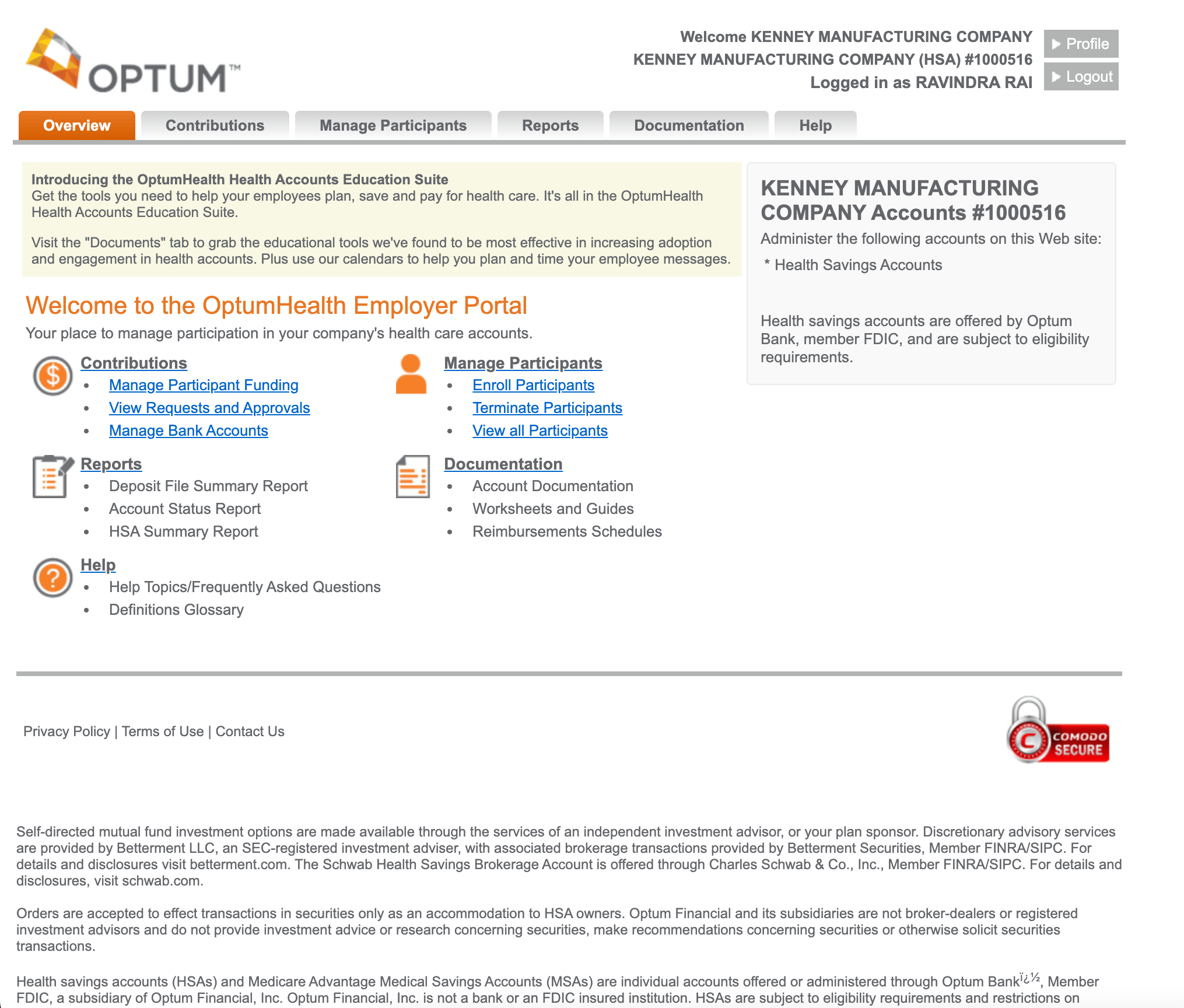
Outdated Legacy UI Example
Pain Point Highlight
“We’re constantly trying to show clients what’s coming next, but the current platform doesn’t help us tell that story. It’s hard to keep or impress clients when the experience looks dated and feels disconnected from their needs.” - Sales Lead
Complication
The platform was mid-redesign when timelines accelerated and the design team’s capacity shrank. With both time and resources constrained, I led a focused team of three designers to address critical pain points and deliver high-impact improvements.
Key challenges included:
- Outdated design system – Unsupported and misaligned with Optum’s brand, causing inconsistencies, slowing development, and risking long-term scalability.
- Inefficient core workflows – Even redesigned areas relied on dense, scroll-heavy pages that buried critical actions and lacked foundational UX patterns like progressive disclosure.
- Fragmented delivery – Misalignment between design, product, and engineering created multiple “sources of truth,” outdated references in product stories, and rework that threatened delivery timelines.
These challenges were amplified by an urgent leadership request to support a high-stakes RFP, requiring a polished, credible demo that clearly communicated the platform’s value to prospective clients.
How might we align design, product, and engineering around a unified system and clear workflows—while delivering rapid, high-quality improvements that boost both customer satisfaction and sales confidence?
Design Challenges
The following examples show how these challenges appeared in core screens and workflows. Outdated components, dense layouts, and fragmented delivery buried key actions and slowed productivity—highlighting the need for a unified system and streamlined design.
First Redesign Iteration Example
Outdated and unsupported design system
The existing system was unsupported and misaligned with Optum’s brand, leading to inconsistencies, slowing development, and risking long-term scalability.
Employee Detail Page Layout Example
Workflow Bottlenecks in Early Design
In an early iteration, the employee detail page, one of the most frequently used views, consolidated critical profile information into a single, long, scroll-heavy layout.
While comprehensive, this approach buried key information and required users to search or rely on separate reports to understand an employee’s status, slowing everyday workflows.
Resolution
To deliver meaningful UX improvements under tight timelines and technical constraints, I adopted a lean, research-driven approach focused on high-impact changes. By utilizing existing insights and collaborating closely with product and engineering teams, we focused on workflows that could be improved quickly without significant back-end dependencies.
This resulted in simplified core experiences, insight-driven dashboards, and guided file upload flows that reduced friction and errors. Additionally, I established a scalable design system, lightweight design operations, and enabled sales with demos that supported go-live and revenue goals.
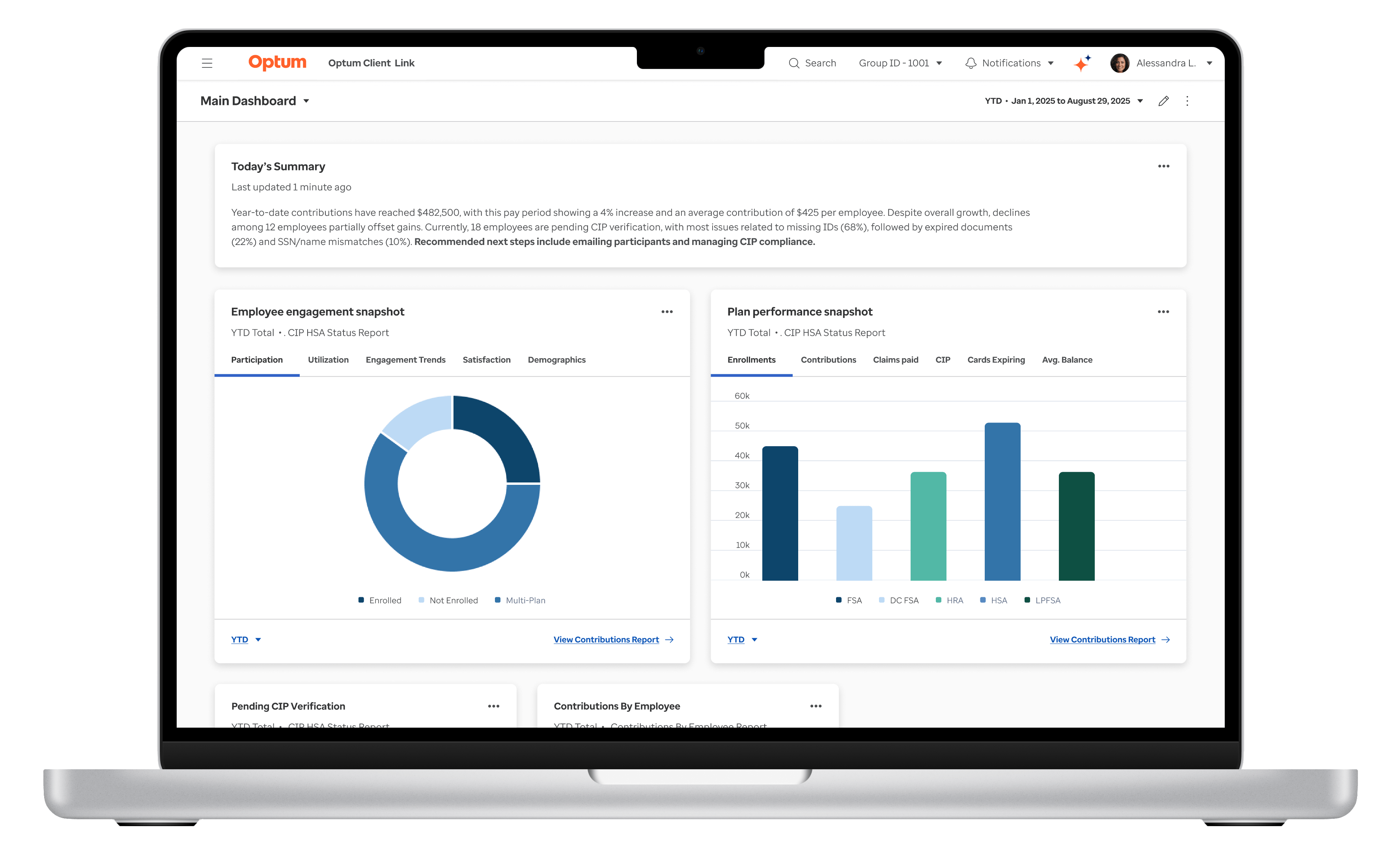
Simplifying Core Experiences to Improve Decision-Making
To improve usability and decision-making for HR administrators, I led the design team in simplifying core workflows and reorganizing the information architecture in key areas. Working within strict technical constraints, we applied a Jobs-to-Be-Done (JTBD) framework to uncover user priorities and design solutions that delivered meaningful impact.
The following examples illustrate how we addressed pain points and created a more intuitive, efficient experience for clients and internal teams:
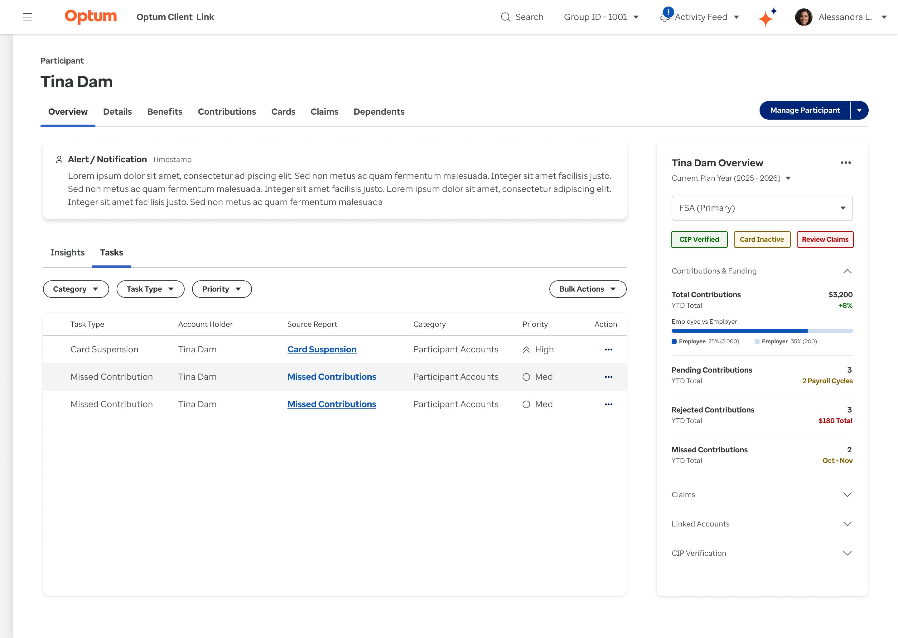
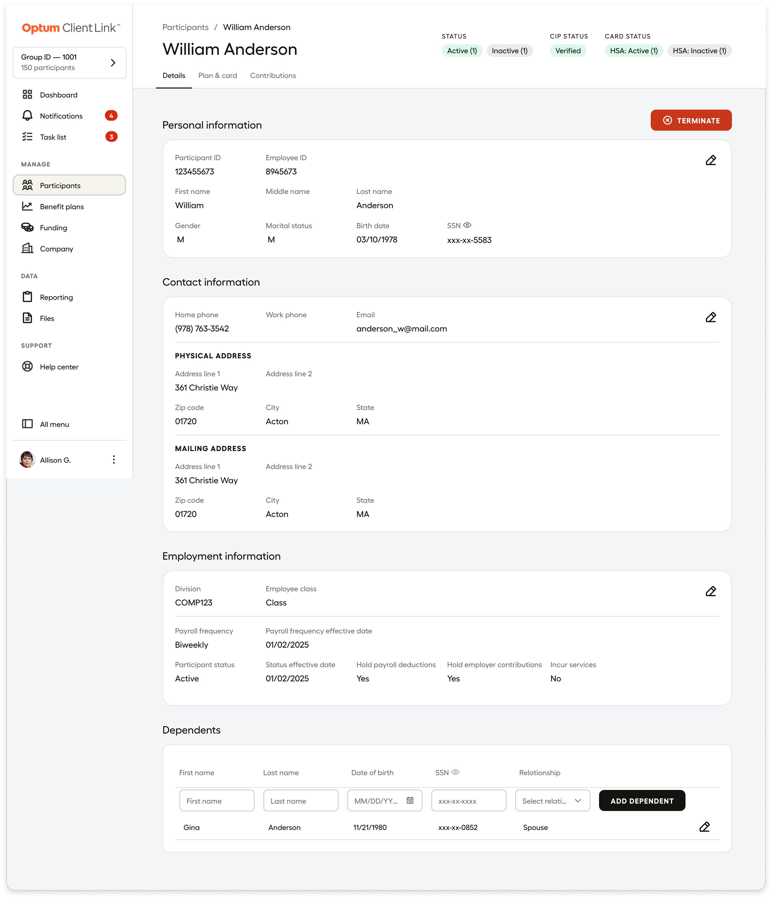
Participant Profile Redesign
Solving Data Fragmentation for Admins
Our UX research revealed that admins struggled to piece together employee status across multiple reports and disconnected pages. Critical information were scattered and hard to interpret, driving delays, errors, and support tickets.
In response, we designed a modern, “at‑a‑glance” Employee Profile that consolidates these signals into one centralized view with summary cards, drill‑downs, and insights helping admins troubleshoot faster, prevent errors, and reduce reliance on reports.
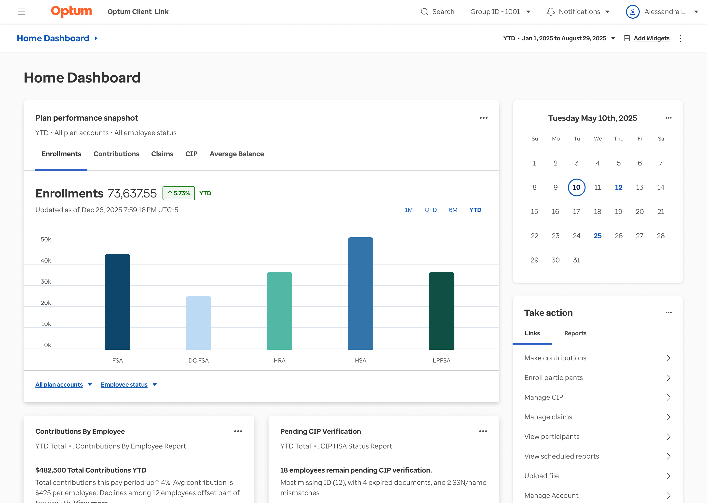
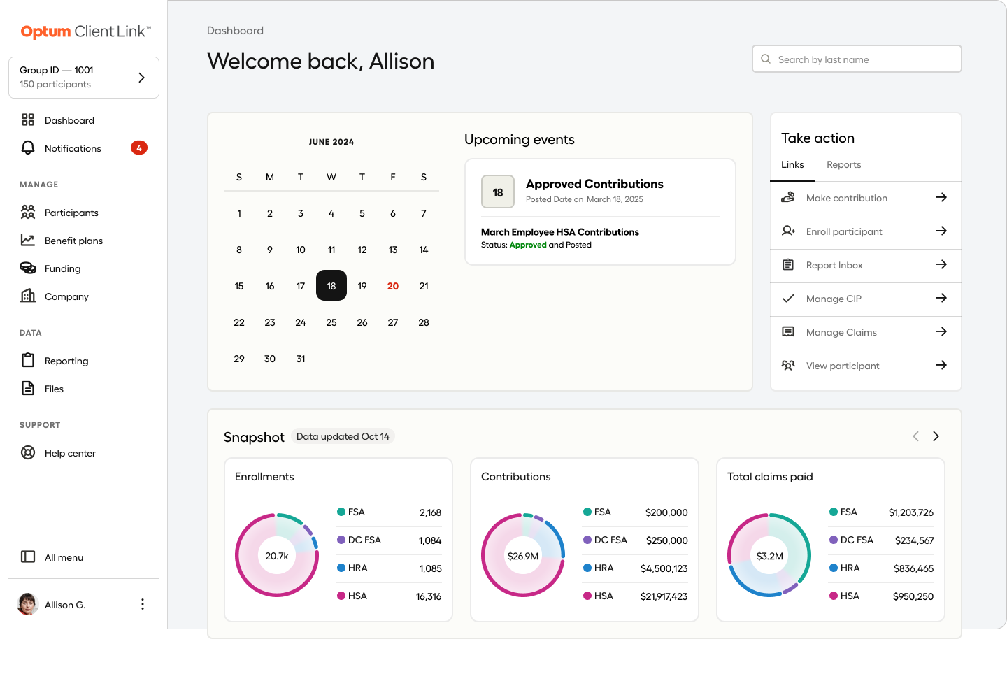
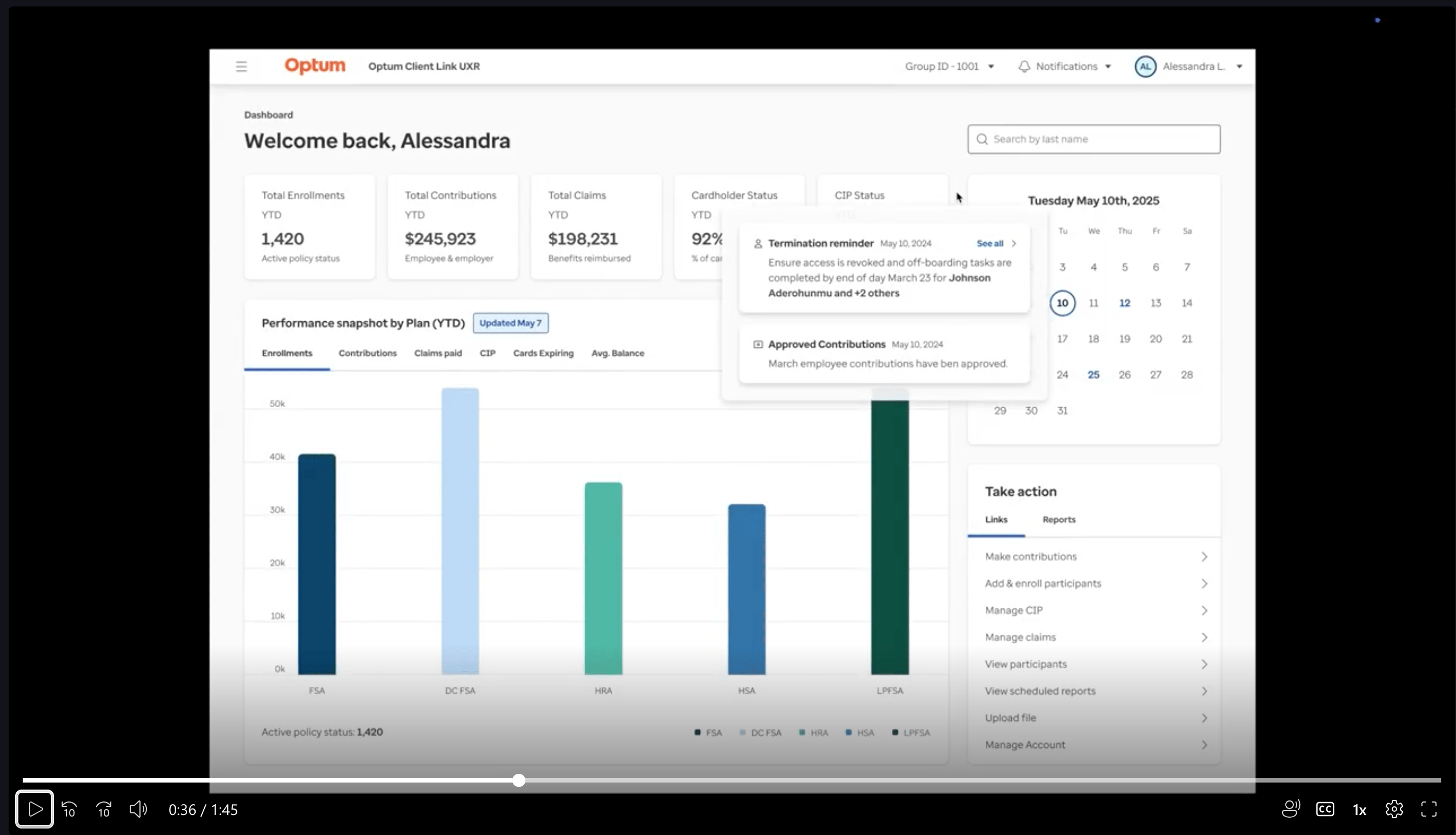
Customizable Dashboards
Tailored Analytics for Faster Decisions
Client feedback revealed that the existing landing page and dashboard was generic, static, and forced different user groups to sift through irrelevant data and stitch together reports, slowing decisions and raising cognitive load.
We answered with dynamic, customizable dashboards: pre‑built views for key domains (e.g., enrollments, contributions, claims), a widget library for tailoring layouts and filters, and inline insights with shortcuts to source reports. By adapting analytics to user roles and workflows, we accelerated data‑to‑action and reduced reliance on separate reports.
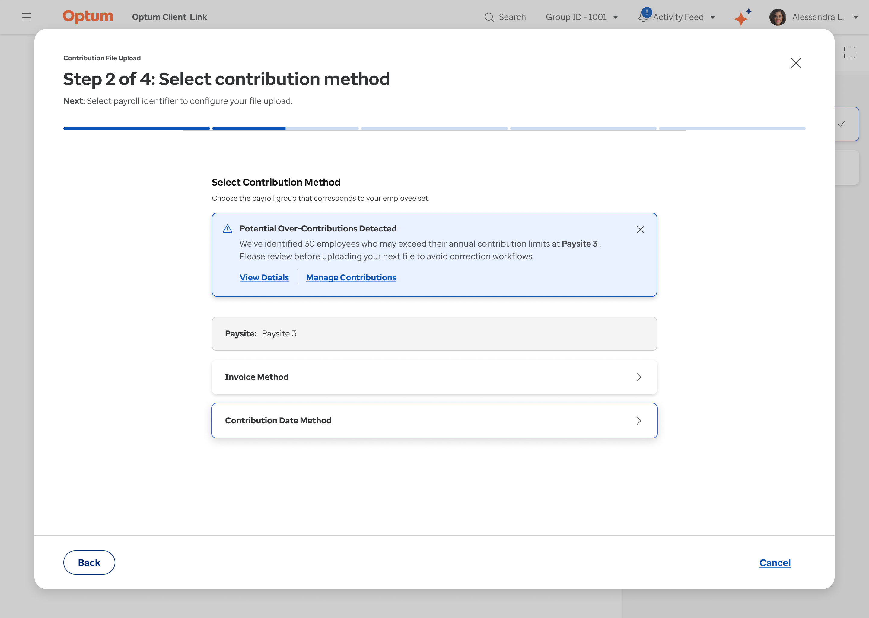
Guided File Upload
Prevent Errors and Reduce Friction
UX research revealed file uploads were a major source of errors and support calls due to limited UI guidance. To address this, we introduced a step-by-step wizard with progressive disclosure, showing progress and required actions at each stage.
We also added proactive in-flow notifications to flag issues like over-contributions before submission—reducing errors, rework, and tax penalty risks for employers and participants.
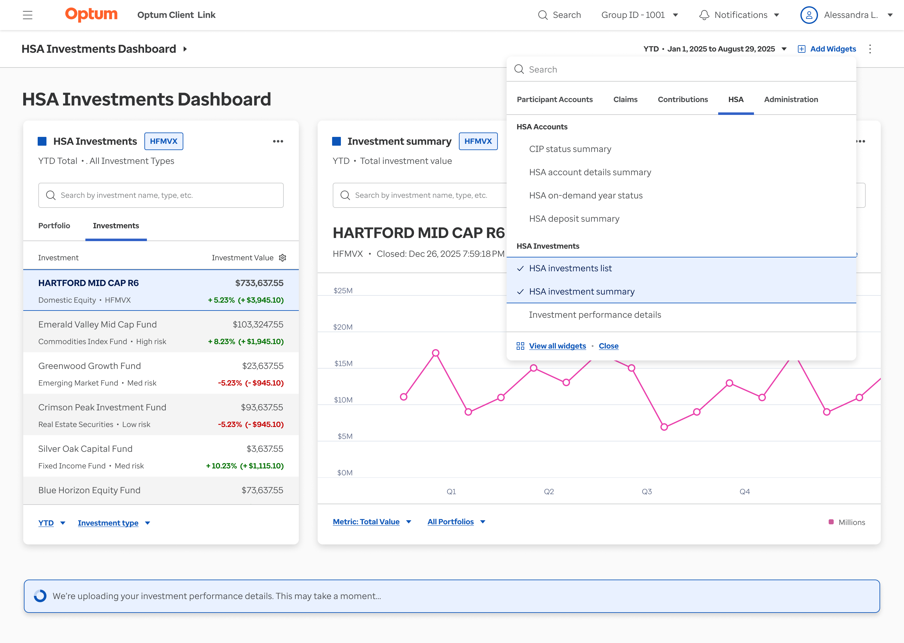
Insight-Driven Dashboards
Transforming Static Reports into Role-Based Insights
Clients and relationship managers relied heavily on account teams for ad hoc reporting because static, table-based reports lacked actionable insights. Using a Jobs-to-Be-Done (JTBD) framework, we identified the critical questions the dashboard needed to answer.
This approach transformed static reports into customizable, insight-driven dashboards, reducing ad hoc requests, and clarifying key areas like HSA investments. This approach will help improve decision confidence and lowering operational overhead for both clients and internal teams.
Establishing a Scalable Design System and Operating Model
At the same time, I led initiatives to strengthen the team’s design maturity by aligning the platform with Optum’s enterprise-approved design system and introducing lightweight design operations and collaboration rituals. This created a shared source of truth across design, product, and engineering, reduced rework, and accelerated delivery. I also translated these improvements into sales-ready demos and walkthroughs aligned with RFP priorities—enabling sales teams to confidently communicate value and support near-term go-live and revenue goals.
(Click to play)
Impact
I led the team through tight timelines and early capacity constraints by setting clear priorities, aligning cross-functional partners, and removing delivery friction. The outcome led to a noticeable improvement in execution, user experience, and commercial readiness:
- Enabled on-time, cross-functional delivery across multiple PI cycles by improving prioritization, clarifying ownership, and reducing design-to-development handoff delays.
- Simplified high-traffic workflows used by thousands of employers, making it faster for HR administrators to access critical data and assess account and performance health.
- Delivered a sales-ready, clickable demo aligned to RFP priorities, accelerating stakeholder buy-in and supporting new business conversations.
- Established scalable design operations, increasing team velocity, reducing rework, and strengthening trust and visibility across design, product, and engineering.